
Donation Page Design: 10 Fixes That Lift Conversion (With Real Examples)
A donation page has one job, and most do it badly. The fixes that lift conversion are rarely dramatic redesigns — they're removing friction, choosing the right suggested amounts, and writing copy that connects money to outcome. When we rebuilt Young Devon's website with an integrated donation platform, it catalysed £25,000 of donations within the first few months. Here's what we've learned works.
1. One page, one job
Strip the donation page of navigation temptations, sidebars and competing calls to action. Someone arriving here has decided to consider giving — every extra option is an exit.
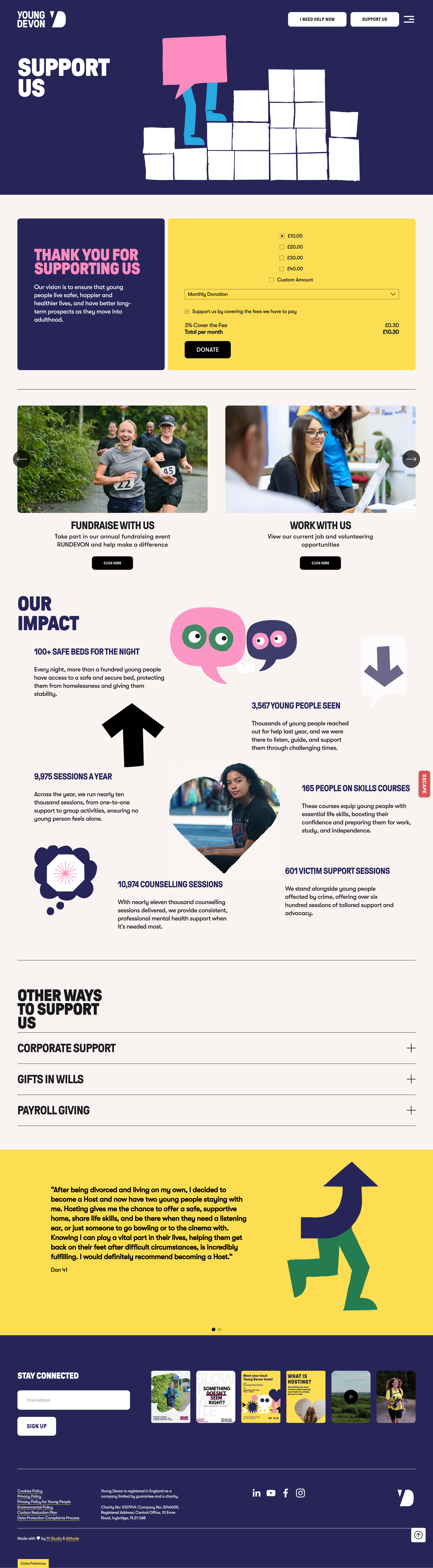
2. Suggested amounts anchored to outcomes
"£10" is abstract. "£10 funds an hour of one-to-one support for a young person" is a decision someone can feel good about. Anchor three or four amounts to concrete outcomes, with your preferred default pre-selected.
3. Monthly giving as the hero, not the afterthought
A £5 monthly donor is worth more than a £30 one-off within a year — and dramatically more over five. Make regular giving the visually prominent option, with one-off as the alternative.
4. Keep the money in the cause
Across six Mind local charity websites, we implemented native donation support — meaning a greater share of every kind donation stays with the charity instead of leaking away in third-party transaction fees. Check what your current processor takes; the difference funds real work.
5. What should you write on a donation page?
This is one of the most-searched donation page questions, and the formula is simple: one sentence of need, one sentence of what the money does, one sentence of trust. Lead with the person helped, not the organisation. "Your £20 gives a young person a safe place to talk this week" beats three paragraphs of institutional history. Save the annual report for the annual report.
6. Mobile-first, thumb-friendly
Most charity traffic — especially from social campaigns — is on mobile. Big tap targets, minimal typing, Apple Pay and Google Pay enabled. Every form field you remove is measurable money.
7. Ask for the minimum, then stop
Name, email, payment. Gift Aid, yes — it's 25% free uplift. Everything else (how did you hear about us, date of birth, phone number) belongs in the thank-you email, not the checkout.
8. Show trust where doubt happens
Registered charity number, secure payment badges and a one-line "where your money goes" near the payment button — not in the footer.
9. Make the thank-you page work
The moment after giving is peak goodwill. Use it: share buttons, a warm human message, and a soft invitation to regular giving for one-off donors.
10. Test one thing at a time
Suggested amounts, button copy, default gift type — small tests compound. The charities we support long-term treat the donation page as a living product, not a launch-day artefact.
We're a specialist charity web design agency and certified B-Corp — you can read what makes a good charity website for the wider picture. If your donation page hasn't changed since it launched, let's look at it together.