
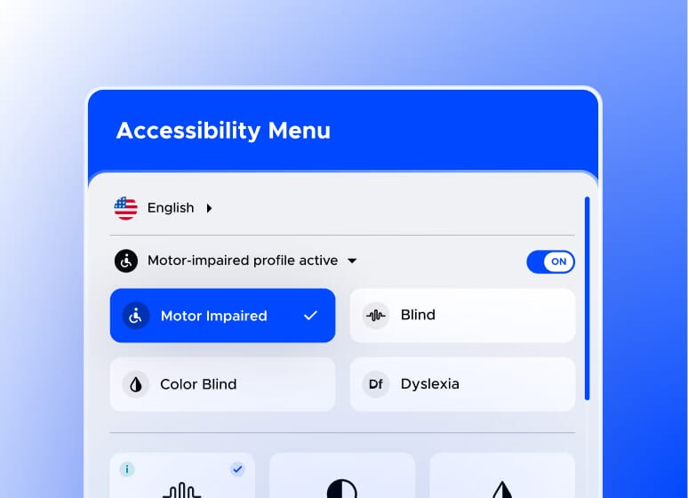
Charity website accessibility means making your website usable by everyone — including the roughly one in four people in the UK with a disability. For charities, this isn't just a legal consideration under the Equality Act 2010; it's the mission. If your charity exists to serve people, a website that excludes some of them is quietly working against you. Here's the plain-English version of what WCAG asks for and where small teams should start.
What is WCAG, in plain English?
WCAG (Web Content Accessibility Guidelines) is the international standard for accessible websites, organised around four principles: content must be perceivable (people can see or hear it), operable (people can navigate it, including without a mouse), understandable (plain language, predictable behaviour), and robust (works with assistive technology like screen readers). Most organisations aim for the level known as WCAG 2.2 AA — the level UK public sector bodies are required to meet, and the sensible benchmark for charities.
Does my charity legally need an accessible website?
The Equality Act 2010 requires service providers — charities included — to make reasonable adjustments so disabled people aren't at a substantial disadvantage. There's no accessibility police issuing fines, but there is legal exposure, funder expectation, and the more practical point: an inaccessible donation page is turning away donors who wanted to give.
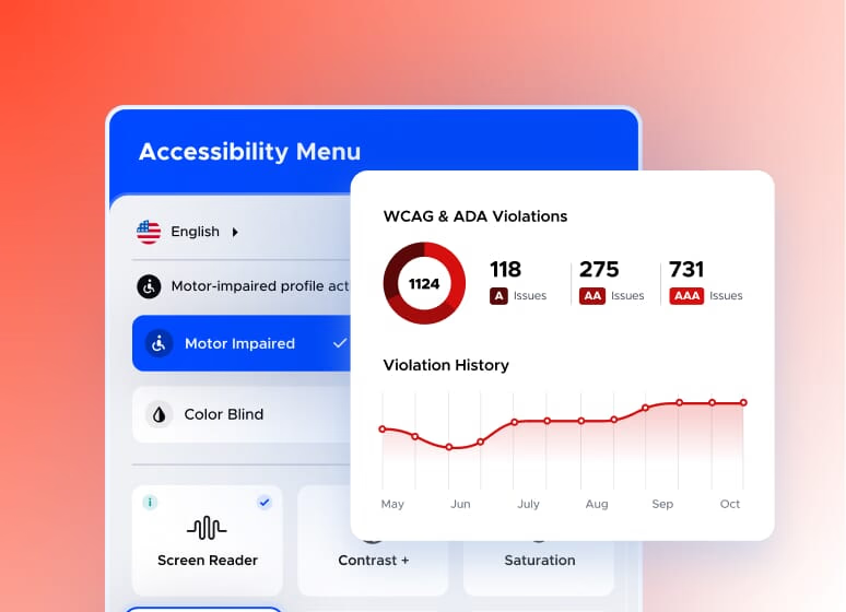
Which accessibility fixes matter most for a small charity team?
Colour contrast: Text must stand out from its background. Brand palettes with pale text on pale backgrounds are the most common failure we see — and the easiest to fix.
Alt text on images: A short description of every meaningful image, so screen reader users aren't left out. Decorative images can be marked as such.
Keyboard navigation: Everything — menus, forms, the donate button — must work with Tab and Enter alone. Try it on your own site today; it takes five minutes and is often revealing.
Descriptive links: "Read our impact report" rather than "click here". Screen reader users often browse by link list.
Forms with proper labels: Especially your donation form. Placeholder text that vanishes when you type is not a label.
Plain language: Short sentences, everyday words. This helps everyone, including people reading in a second language or in a moment of crisis.
How do we check our charity website's accessibility?
Start free: run your key pages through the WAVE browser extension or Lighthouse in Chrome, then do the two manual tests automated tools can't — navigate by keyboard only, and read your homepage aloud (if it sounds like a grant application, simplify). For charities serving disabled communities directly, a professional audit including real assistive-technology testing is worth budgeting for.
Does accessible design mean boring design?
No — and our work proves it. When we designed Young Devon's mobile-first website, accessibility and visual impact worked together: clear structure, strong contrast, image-led storytelling. Enquiries rose within days of launch. Accessibility constraints are design inputs, not design limits.
An honest note: unlike most topics we write about, accessibility isn't something to do because people search for it — it's something to do because it's right, and because the searches that matter are the ones your site's users are making. As a B-Corp and specialist charity web design agency, we build to WCAG principles as standard. If you'd like a plain-English accessibility review of your charity's website, get in touch.