

The best charity website designs do something most charity websites don't: they make the visitor the hero, not the organisation. Great charity sites are built around three visitor questions — who do you help, how can I get help, how can I help you — answered fast, warmly and on a phone screen. Here's what the strongest examples do differently, drawn from our own work with charities across the UK.
What makes a charity website design effective?
Clarity beats cleverness. Within seconds, a first-time visitor should understand the cause, feel something, and see their next step — whether that's donating, getting support, or volunteering. Everything else on the strongest charity sites serves those seconds: image-led storytelling, plain language, a donation journey with no friction, and accessibility as a foundation rather than an afterthought.
Example: Young Devon — designed for the people it serves

Young Devon is the South West's largest young people's charity, and its audience lives on mobile. Working alongside 51 Studio, we designed a modern, image-led, mobile-first website with all-new branding. Within days of launch, enquiries rose significantly — young people finding the support they needed — and the integrated donation platform catalysed £25,000 of donations in its first few months. The lesson: design for your actual audience's actual device, and both sides of a charity's mission benefit.
Example: Mind — infrastructure that protects donations
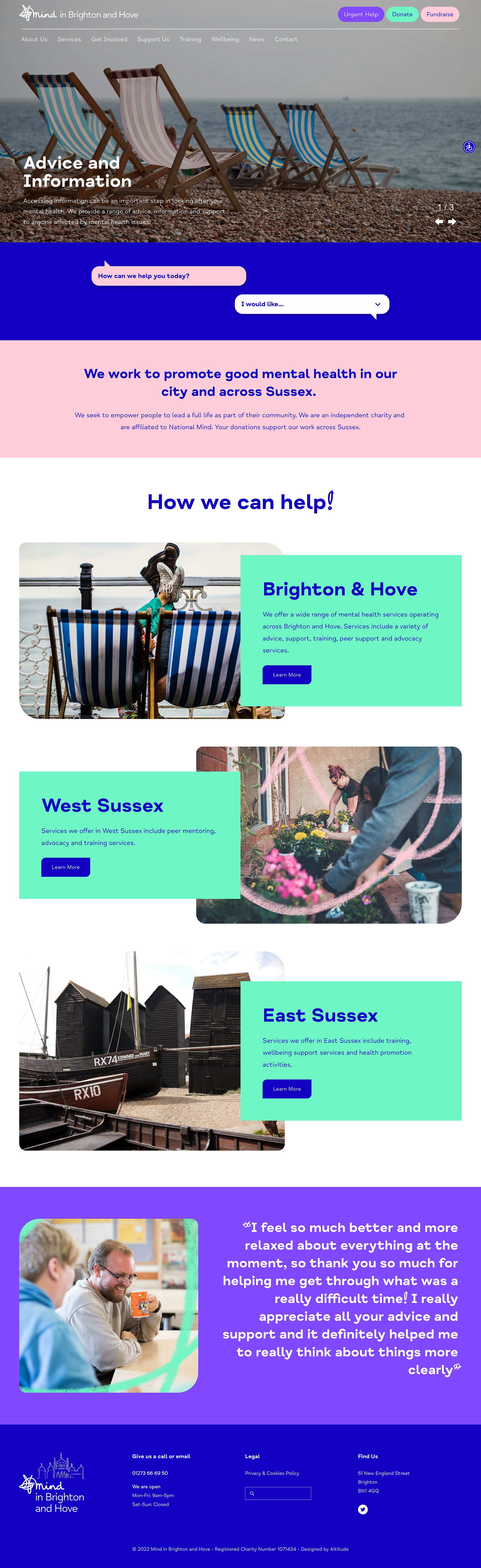
Across six Mind local charities, our design and branding support included native donation functionality — meaning a greater share of every donation stays with the charity instead of disappearing into third-party transaction fees. The best charity website designs aren't just beautiful; their plumbing is on the charity's side. When someone gives £20 to mental health support, the design's job is to make sure mental health support is what it funds.
What do the best charity websites get right that others miss?
A "get help" journey as polished as the donate journey. Many charity sites optimise for funders and forget the person in crisis at 2am. The best serve both.
Impact shown, not asserted. Numbers, stories and faces — "5,500 young people supported this year" — rather than adjectives.
One clear ask per page. Donate, volunteer, fundraise and campaign all matter, but a page that asks everything converts nothing.
Accessibility as standard. One in four UK adults has a disability; the best charity sites are built to WCAG principles from the first wireframe.
A donation page treated as a product — tested, refined, anchored to outcomes. Our donation page guide covers the specifics.
How can a small charity apply this without a big budget?
Prioritise ruthlessly: clarity of message, mobile experience, and the donation journey — in that order. A modest site that nails those three outperforms an expensive one that doesn't. And when you're ready for professional help, our Good Business Fund exists precisely for purpose-driven organisations: up to £15,000 of free creative and digital consultancy time, awarded annually.
We're a B-Corp and specialist charity web design agency. If your charity's website isn't pulling its weight for the people you serve, let's talk.